

Whodunnit? Why Counting Carbon Emissions is Far More Complicated Than it Looks
Whodunnit? Why Counting Carbon Emissions is Far More Complicated Than it Looks
6. And maybe science can help (9 min read)

Have you ever seen the news with detailed graphs of how the ridiculous amounts of CO2 each country emits, and wondered: How the heck do they know that? Countries have hard enough time counting the number of people living there, much less invisible gases floating away.
So I used my google-fu to investigate. The first step to understanding is simplification: How would I go about calculating individual carbon emissions? I guess there are 3 parts to this answer.
The simple part: My fuel use for transportation and the household, as my utility bills tell me how much I consume. There are airline CO2 calculators for the times I fly.
The tedious part: My electricity usage, because I have to know if the power source is coal or renewable. The emissions data is available for each of these sources in scientific literature.
The hard part: I bought a Nvidia GPU to crunch numbers (Not crypto, no thank you). Since I got it delivered, my direct carbon emissions are zero. What about the indirect part? The delivery truck brought it to me from the warehouse. The GPU manufactured a continent away in China, shipped across the oceans, loaded inland onto freight trains, and finally on a semitrailer to get to the warehouse.
Ugh, this is getting complicated. But let me go deeper to appreciate the inanity of this exercise.
The energy costs of melting silicon to make the chip. Plastic components made from petroleum. The mining and manufacturing of metals in the circuitry and wires. Packaging costs. A seemingly simple question has me googling transcontinental supply chain efficiencies in under 5 minutes. I give up.

But one thing is clear: I am responsible for far more emissions than I give myself credit for initially. Because I was counting only my production-based emissions, but I failed to acknowledge the emissions from what I consume: consumption-based emissions. This includes my phone, computer, watch, clothing and even groceries. Yet, CO2 is CO2, no matter where it is produced.
All this complexity is for one person.
Now imagine the craziness of running these numbers for every country. That is exactly what some people are doing (For their own souls, I hope it’s not in Excel). Here is the map for trade-adjusted carbon emissions:

But why bother? Tax the polluting nations! seems to be the war cry today. Fair, but only if you know how much they pollute. Like most things taxation, there is plenty of motivation to get creative with accounting to avoid paying up. Unfortunately, since our entire climate strategy seems to revolve around carbon taxes, carbon accounting suddenly becomes far more important than just a niche scientific exercise.
What doesn’t get measured doesn’t get managed: Trade-Adjusted Emissions
I’ll pick an example of 3 countries: The USA, China and Australia. I picked these three because each economy has a different characteristic, so their interaction shows the complexity of globalized trade1. The chart shows how much consumption-based emission each country causes from its imports, as a percentage of its domestic emissions.
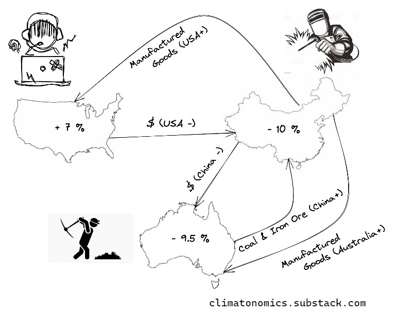
The US focuses on its knowledge sector (think Silicon Valley and space tech). Companies make money by developing intellectual property for products, even if they make it elsewhere2. The US emissions should add 7% because it imports nearly all its manufactured goods.
China has skilled labor and low costs3. This makes it far cheaper to manufacture in China. In short, it’s the world’s factory. China should therefore subtract 10%.
Australia is rich in coal and iron. Most of it goes to Chinese factories. Australia imports much less the US, as its population is quite small (smaller than Texas). So overall, Australia should subtract 9.5%.
After analyzing this data, I could see some broad trends: I made 5 categories of countries based on per capita income.
High income goods importers - US, UK, Most of the EU, the UAE, Saudi Arabia
Low or mid income, industrialized goods exporters - China, India, Russia, South Africa
High income resource exporters - Canada and Australia.
Low or mid income goods and resource importers - Pakistan, Sri Lanka, Venezuela, Ecuador, Peru, Colombia, Most of Africa and most of South America.
Low income resource exporters - Mongolia, Kazakhstan, Most of sub-Saharan Africa.
My analysis is far from complete, but I discovered it is not just “rich” countries that have high trade-adjusted emissions. Some very poor nations do as well, for entirely different reasons4.
Still, notice the huge data gaps in the map? Why is most of Africa unaccounted for? How accurate is this whole thing, anyway? Here is where it gets really interesting.
Science detectives: The Global Carbon Budget
The map derives its data from an established scientific report: the Global Carbon Budget project, or GCB. The GCB is a publicly available annual report with analysis from 70 institutions worldwide, calculating carbon sources and sinks.
Carbon sources are activities that emit CO2. This includes burning fuel for any purpose (industries, power, transport). Land degradation is also a carbon source, because it removes the ability of forests to store carbon. So is agriculture, because we use energy intensive fertilizers, farm equipment and machinery.
Carbon sinks absorb CO2 and prevent them from staying in the atmosphere as a greenhouse gas. Crops are a carbon sink, but the biggest sinks are forests and oceans.
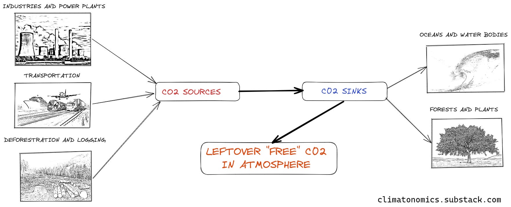
While our sinks have a finite capacity to store carbon, our ability to generate carbon is…. well we have not hit our limit yet. We already produce far more than the sinks can absorb. The rest escapes into the atmosphere, where it acts as a greenhouse gas screwing with our climate.
We can easily measure the atmospheric CO2 concentration. But this only tells us the absolute concentration, but not The When, the Where and the How **of these emissions, which is important for climate policy.
The GCB does this by calculating carbon “imbalance”: You add up CO2 emissions from all the sources for each country and you subtract from it the net CO2 captured by the sinks.
How is each source calculated?
Industrial and energy emissions are obtained by statistics each government provides on its fuel consumptions
Land use source and sink: The GCB uses data on deforestation, afforestation and agricultural land use worldwide. They plug this data into mathematical models that estimate on how much CO2 they emit. This gets complicated, since not all plants and forests are alike in how they process CO2.
Ocean sink: How much CO2 the oceans capture is still an open question, because some oceans absorb more than others. Therefore, the GCB runs all the models which use different scientific measurements of CO2 absorption, and uses the average instead, leading to a conservative estimate.
Finally, if we subtract the sinks from the sources, the leftover CO2 is called the Carbon imbalance
Free CO2 = CO2 sources - CO2 sinks.5
The free CO2 goes into the atmosphere, causing the greenhouse effect. The free CO2 is the quantity of concern and has been rising every year (the famous Keeling Curve).
Measuring CO2 is one thing, but knowing who is responsible is another. That brings us to the big headache…
… So whose CO2 is it???
Time for a riddle.
A traveler takes a flight from Paris to Dubai. Which country owns the CO2 emissions?
Is it country of origin (France), country of destination (UAE), citizenship of passenger (Canada) or the airline’s country of registration (Germany)?
This is the carbon budget equivalent of the chicken or the egg riddle. Except that there are way too many eggs for too few chickens. And no one agrees who put the damn chickens there in the first place.
Can’t decide? Turns out no one can. So GCB does not add these emissions to any single nation, but uses it to make sure they do the global source-sink math right.
Despite these hiccups, many high-income countries that are required by the United Nations Framework on Climate Change to submit detailed data every year to enable these calculations, and the rest are not required to report as often6. Still, many countries do, with the intention of common good7.
But several nations (especially in sub-Saharan Africa) lack the technical capability to report. Most notably, the mining and deforestation hotspot of the Congo, which supplies most of our cobalt for our global e-vehicle revolution, under highly questionable conditions and carbon emissions.
Also, countries often lie to avoid any future emissions based taxes. Even if the government doesn't, companies lie on a bigger scale (like the Volkswagen scandal). Companies lying to protect profits. So surprising. Considering these motivations, the GCP is likely underestimating how much CO2 gets pumped into the atmosphere.
Carbon Monitoring from Eyes in Space
With fraud and greenwashing making the real emissions data increasingly suspect, an alternative project emerged in 2021 to settle this once and for all. This is the Climate TRACE (Tracking Real-Time Atmospheric Carbon Emissions) project, which aims to use a mixture of satellite observations and AI to identify emissions from sources in near real-time: This makes the TRACE project a game changer. The whole gamut of earth sensing satellites in space - can answer the “When, Where and How” questions with no administrative cooperation. It uses over 300 satellites that are already in orbit, with thousands of sensors onboard. This makes them cost effective, and the first results are already in.
Satellite data has its own errors (cloud cover, instrument limitations, etc.) and so does AI. But this isn’t about perfection, but about getting better data than what we have. The aim is to capture sources that are unreported or under-reported. There are thousands of these worldwide, and hiding data from satellites is near-impossible, even if they try.
Conclusion
Accurately estimating carbon emissions is critical for adapting to climate change. Yet, it is a complex exercise because the data relies as much on honesty and effective administration as it does on science. A lot of detailed questions remain to be answered since do not have 100% information on emissions worldwide. The next phase of carbon accounting appears to move more towards scientific monitoring, to prevent using inaccurate self-reported data from countries. More significantly, with the recent popularity of carbon taxes, this data might become a global policy tool, compared to only existing in the scientific realm. I wonder how much “excess” emissions the TRACE project will find, and how it will skew the math we have done with the existing emissions. I would love to hear your thoughts!
Dear reader, welcome to the 6th issue of Climatonomics. I keep my content free and if you find it useful, can you please support by sharing this with your friends and colleagues?
Similar complex inter-relationships exist for several countries, but typically high income nations tend to be positive (red) in trade-adjusted emissions, while low to middle income nations tend to be negative (blue).
Apple is a great example, with its “Designed in California, Assembled in China” strategy. The relative strength of the US dollar also makes manufacturing too expensive relative to Asia.
There are a variety of policy reasons outside the scope of this post, since China does is not rich in fossil fuel reserves.
These countries are are unable to export goods, despite labor being cheap relative to high-income nations, because they are less industrialized and/or lack of political will.
Since we measure the atmospheric Co2 every year, the budget for a year must only count the emissions from that year - and not the ones produced from the previous years, so that is also accounted for in the equation.
Called the “Annex 1” countries https://www.oecd.org/env/cc/listofannexicountries.htm
India and China fall under this category as non-Annex 1 countries, but both maintain data. https://unfccc.int/parties-observers
This is really interesting. I don't think there's a way to find a standard, how much is too much emission and who to charge for it. There are so many factors, not only importation and exportation, but consumption, culture, land, the amount of people. There's no common ground there.
There's a lot to discuss and certainly a lot to think!